 QC
QC
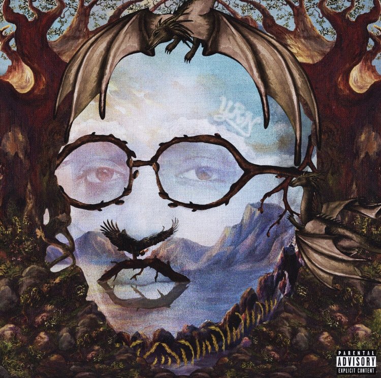
On Thursday night, Migos rapper Quavo announced that his debut solo album Quavo Huncho will be dropping next week. The Atlanta artist shared the project’s cover art alongside his announcement and it was a bit of a shock. The image is an optical illusion of sorts that is one part bucolic woodland scene and one part portrait of Quavo. Needless to say, it was pretty divisive and Twitter timelines were slightly messy about it.
The artwork was done digitally by 25-year-old artistic director Mihailo Andic from Oakville, Ontario. He’s best known for his work with Lil Yachty, including the memorable album cover for 2017’s Teenage Emotions. Speaking to The FADER from Atlanta on Friday, Andic acknowledged that his work can sometimes be controversial. “People definitely have conversations, and reactions, and it gets them talking,” he said. “I hold myself to that high standard, of having a piece of design that people are either on the fence about or they really, really like it. I always try to make positive conversation and not a lot of people are able to do that.”
The album cover is just his first work with Quavo, and there will be a few more things people see. He explained to us how the whole thing came together and what it means for Quavo’s growth as an artist.
With a cover as unique as this, how did the initial talks about design begin?
Quavo initially approached me about the idea. He sent me a few references. The cover is referencing these classic optical illusions and surrealism paintings. We had a tight timeline to be honest, so I had to figure out how I was going to bring some of these ideas to life. It was sent to me and I took it from there. We worked closely and collaborated until we had the final product that we were happy with. I think we did a pretty good job and we made our own little world. People were discussing and talking about it, it was cool.
From the initial conversation until after it dropped last night how long did you have to put it together?
The deadline started right after I got the references and they gave me a heads up. I finished the cover in 48 to 72 hours. We had a first round, after that we did a few revisions and I did one more concept which ended up being the final cover. That was the one that stuck out. We all immediately know that it was going to be the final product. We all looked at it and thought, this is really cool, I don't think people would expect something like this.
It was really fast, really swift. I felt like I kind of work better under pressure sometimes. It was good that there was an idea there and it wasn’t freestyling or coming up with a concept out of the blue. It was good to have a set idea and had our minds made up for what we were going to bring it to life.
I saw a lot of reactions about it on my timeline last night. It’s a pretty divisive cover — I saw a lot of people loving it but a lot of people using “this ain’t it” memes.
[Laughs] That's the culture we're in right now, it’s hilarious. That kind of meme is used on everything, so I was kind of expecting that. But I don’t think people were expecting Quavo to do something so out of the box like this. A lot of the previous covers were really photo based. You saw the translation from the first [Culture] cover to the second one. This was such a big moment, I don't think people were expecting something so different and unique. I embrace both the positive and negative reactions. At least it had people talking. Sometimes people drop covers and once it gets released, no one is really discussing it. It kind of goes under the rug. It’s cool to see people having a conversation about it regardless of positive and negative. From what I saw, from the people who know about creative direction and design, they really enjoyed it. Then there were people who didn’t really understand it. It’s cool and every one has their opinions. From what I saw it was cool seeing both reactions.
From a personal perspective, were you surprised when he sent you the references that he wanted something so different?
I was actually so happy he sent me that. I've seen something like that but I never had the chance to do anything design-wise with that style. Right when he sent me it and I understood where his head was at, I thought, this could be a really big moment for him and I did my best to bring it to life. I think he needed something like that since this is his first solo project. It's good to see him do something out of the box and do something different from everyone else.


