 Credit: Cameron Tidball-Sciullo
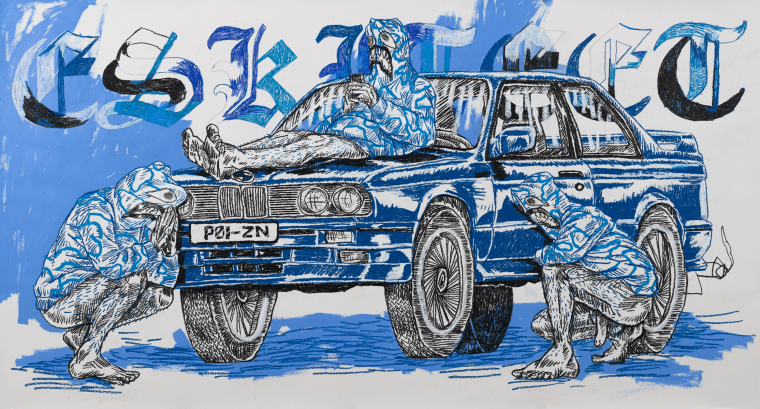
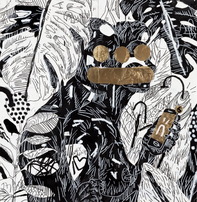
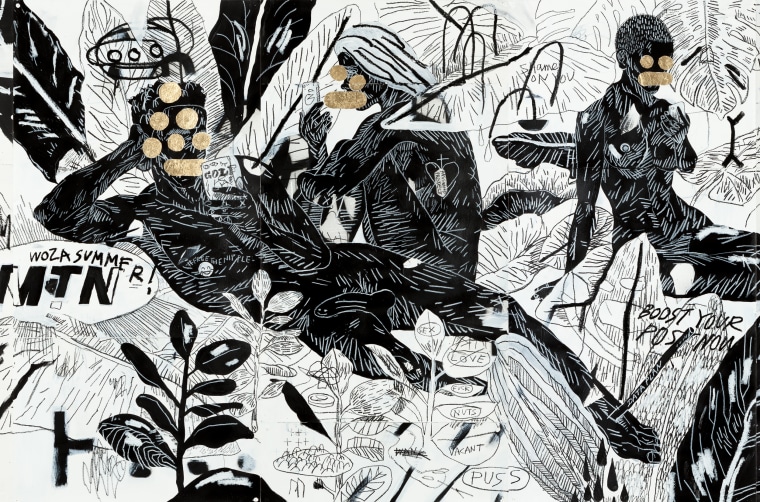
At first glimpse, Louis de Villiers's drawings are disorienting. The line work is busy which creates a jungle of details but the presence of recognizable brands and objects like a phone, a Nike Swoosh, and an ad to “boost your post now” provide remnants from our current world to make sense of a post-internet world from his mind. The Durban-raised visual artist, art director, and graphic designer currently lives in Brooklyn and works his full name (he was formerly known as SKULLBOY). Over the years, he has created 2D and 3D art around the themes of capitalism and social status, and how they're affecting the human psyche.
de Villiers was set to show his largest drawing, a 5’ x 7’ piece titled The Monolith, at The Torrance Art Museum in L.A. at the beginning of April, but Covid-19 has put that on hold for now. It explores the reason for an instinctual reaction people have to a deconstructed brand logo like the Supreme red box. His other projects have included FLEX 'N FINESSE and YOU & ME. He's currently working on OH HAPPY MEAT, which is a collaborative project with Richard Hart, where they profile various artists with pictures of their work as well as the tools that made them, their hands.
You can check out Louis de Villiers' art and design on his websites and Instagram. He is represented by Kalashnikovv Gallery in Johannesburg, South Africa, whose site he also just redesigned.
Read our interview with the disruptive artist below conducted via email before quarantine delayed his Torrance exhibition.
Did you take art in school growing up? What kind of art student were you?
Louis de Villiers: Yeah, it was either that or accounting [laughs]. I guess I was a pretty square kid, getting good grades and staying outta trouble. I was just discovering graffiti, so when we weren’t sketching gatdam apples, my art class homies and I were drawing in our blackbooks. It's safe to say, I never really stepped out of line til I found out about graffiti.
Why do you strive to make art that makes noise? Or is something that you work to reveal?
Although my scenes are fairly serene, the mark-making and drawing-style definitely aim to be aggressive and overwhelming. By rebelling against the "scroll culture," I’m trying to create these walls of visual noise that the viewer needs to swim in for a moment to discern and appreciate.
Do you listen to bands of a similar sound when you make art?
I listen to a lot of things but there’s definitely tracks where I think “I wanna make a drawing that sounds like that!” I want it rough and fast like Da Beach Boyz’s "Locals Only," sludgy and layered like Ho99o9’s "Bone Collector," beautiful and chaotic like DREAMCRUSHER's "PSA"!
Your work has always explored this modern, post-internet age as a bystander. How does that take shape these days?
I’ve worked on a number of themes within this genre but over the years have been dissecting these topics through a metaphorical jungle-society. I’ve ultimately orchestrated a context, an isolated group, that I can gradually introduce current ideas or observations that I find interesting.
I feel like my practice is two-fold in a sense as I’m not only capturing the quiet lives of this tribe; but also creating the artifacts that this "hypothetical" society would produce. As an elevated society, I imagine that there would be resulting creations and I try to capture those in these explorations.
Why did you come up with the idea to center your art around an isolated group of people?
It’s a relatively new introduction to my practice, but with an isolated group I could pull focus as well as control the circumstances. By taking a relatively untouched society and introducing small ideas from modern life, I’m able to then cut out other commentaries to see this concept at work, unhindered.
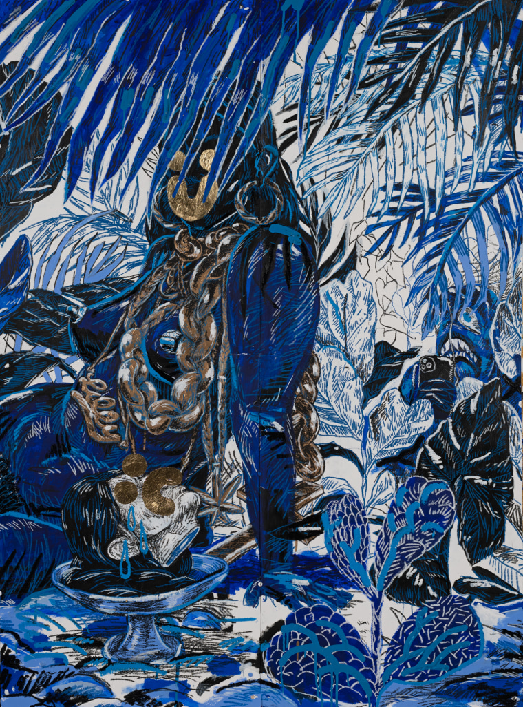
But there’s also been a shift. You’ve been painting exclusively in black, white and gold leaf since roughly 2011 and recently there was a move to blue. What prompted this move?
Initially, when I introduced this hypothetical society, their introductory point was through the lens of social media and cellphones. So, as the tribe developed, I wanted a visual cue to communicate a cultural progression. They therefore achieved the hallowed "blue tick." They had become "verified" and in doing so gained some sort of alluded social currency or clout. So it’s these sorts of nuanced indicators of power and value that I’m really interested in.
By adding the blue tick to this society, it signifies some kind of progress. Is there an end goal in sight of this society?
I’ve been painting in Black, white and gold since 2011; but this transition into a "blue-phase" is a visualization of this social progress. In a time where our cultures find their places through social media, I find it interesting how a verified blue tick signals online validation that inevitably spills over into Real World social currency. Ariana Grande is at the top of the social game but you don’t see her slowing, do you?
In the post-internet age your art depicts, is the internet used as a tool for good or bad? Is there a normative value in this world?
I think that my framing of the internet has changed from a "tool" to a "constant" – something that’s no longer specific in its intent, but something much broader in use and more pivotal to everyday life. It’s like asking if you would take a breath of air to curse or to sing?
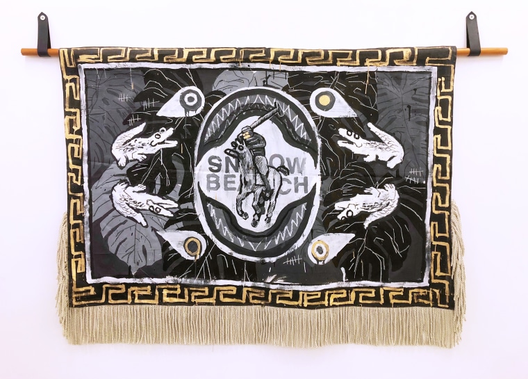
As you became more aware of objects with markings on them therefore gaining more meaning, why did your attention go to brands specifically?
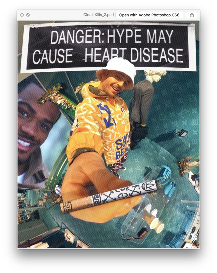
I mean, Egyptian hieroglyphics is one of the first recorded written languages and I think it's interesting how we’ve come full circle to that system of icon as language, like emoji and brand logo. I’m more interested in brand icons because where emoji’s generally communicate emotion, brand-language has the potential to communicate social standing.
So I guess this idea of "brand as hieroglyphic" developed into the DRIP DRIP series (the bootleg tees)?
I think it’s interesting how some brand languages are recognizable even when you broke them down to their core elements. By the fact that we decipher this language, means that we’re also implicit in this cycle of perceived clout. I also like the idea of accumulated currency by the fact that there’s a number of brands collaged together.
How would you answer someone saying that highlighting these brands only feeds into their strength whereas your art might be trying to poke fun at them?
I think that speaks to one of the tensions I play with in my work: does the viewer find value in the executed artwork before them, or are they simply responding to the perceived value of the items depicted in the works?
Is there a way for us to free ourselves of those brand attachments? Should we strive towards that?
The way we dress is the generally how we communicate to the world how we define ourselves; and so as long as certain brands are associated with certain cultures, they will always be used as a signaler we use to show our affiliations. I don’t think it’s necessarily something we should strive to move away from. But Christ, I would like to see 12-year-old ‘STYLE GAWDS’ in $2500 sneakers fuck right off.
